Our ARTINA Kombucha
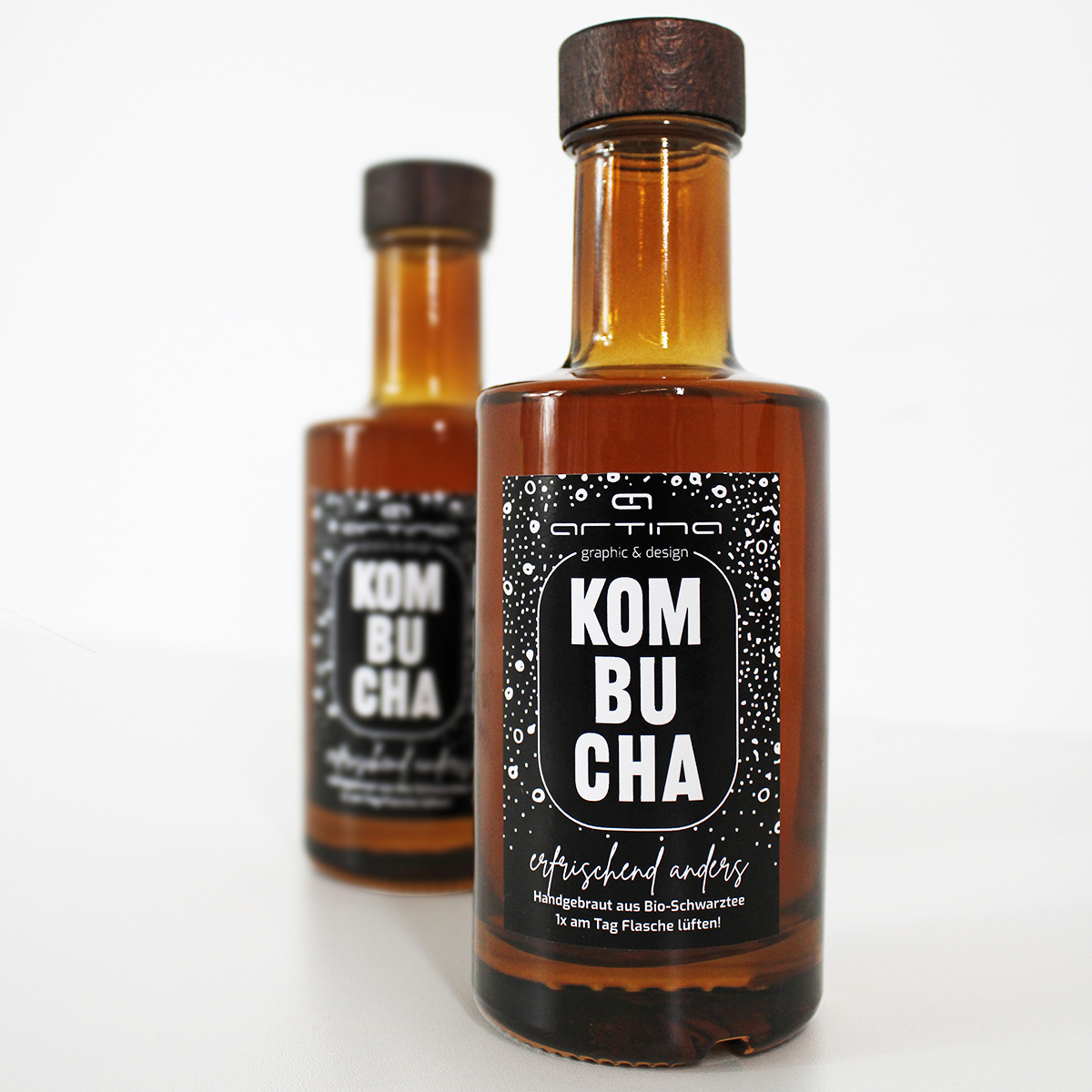
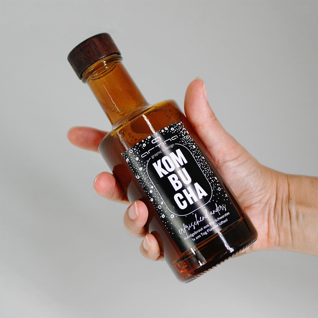
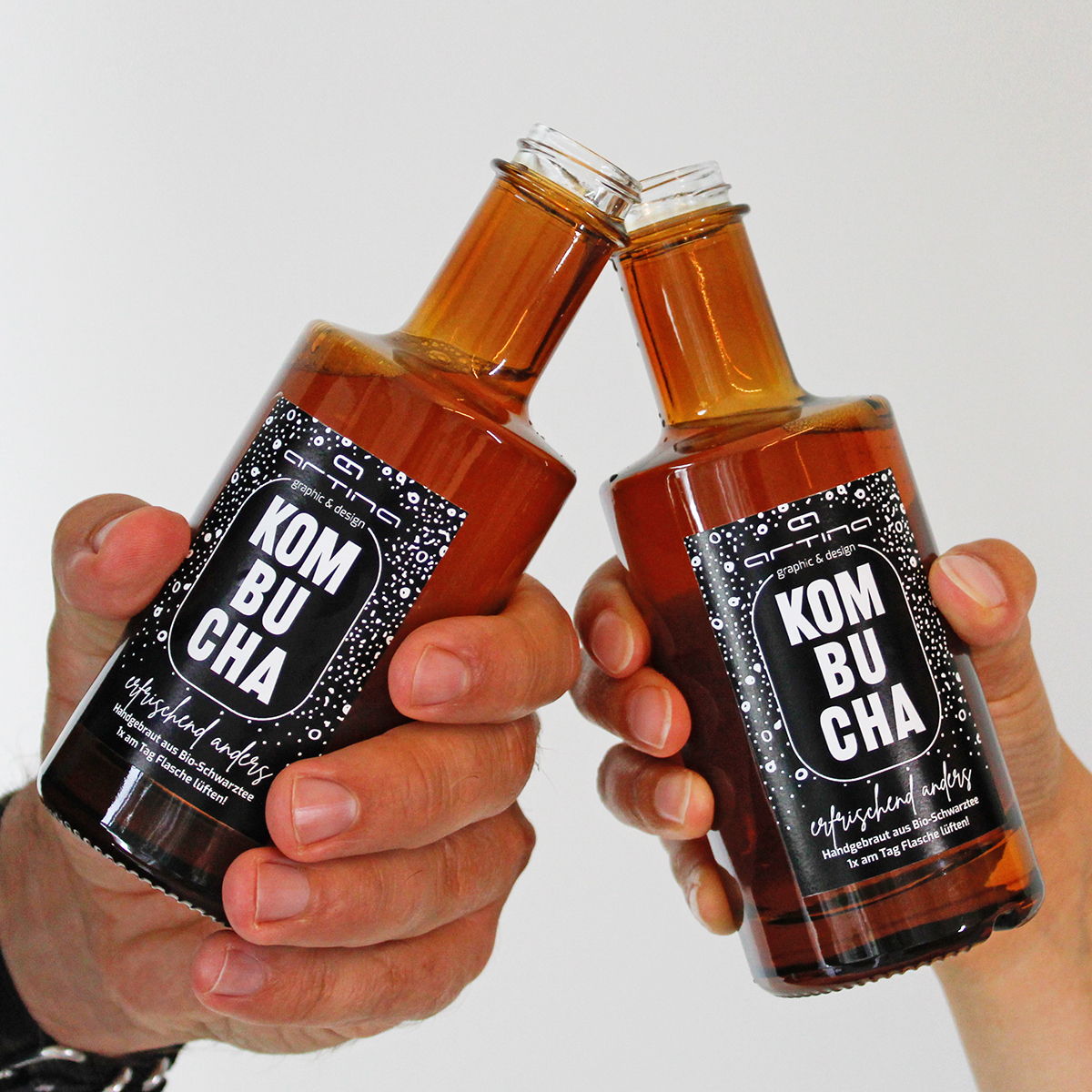
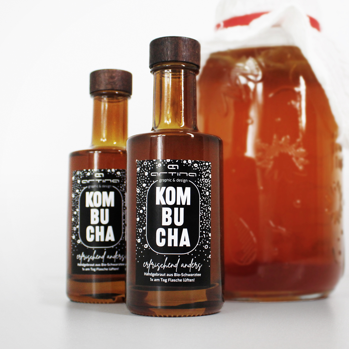
To find new inspiration for our graphic recipes for clients, from time to time we develop culinary team projects that result in original gifts. This is how our ARTINA Kombucha was created, which we prepare ourselves. When designing the bottle label, we were able to return to our actual expertise: refreshingly different graphic design. The simple black and white label fits into the ARTINA corporate design. The border of the title represents the fermentation glass, the stylized fizz in the background provides that certain ‘spritz’. The bottles themselves complement the apothecary-style look. If you would like a taste of our ideas in the area of packaging design, you should contact us quickly and come over for a chat – kombucha tasting included!
Ingredients:
Packaging design
Label design
Spices:
1 portion of corporate design
1 PK reduced coloring
10 ml apothecary style