Logo & Corporate Design for Hasana
The cooperation with Hasana involved a new starting position as the field of natural food supplement was new to ARTINA. The creation of a new delicacy – the Hasana corporate identity – demanded a fitting approach. Both word and design mark dispose of an individual touch.
The design mark was inspired by the origin of traditional European medicine. The distinctive lines shall remember of runes. The symbol itself can depict the letter H, a tree, a flower or human being. Thus, it is up to the viewer’s taste.
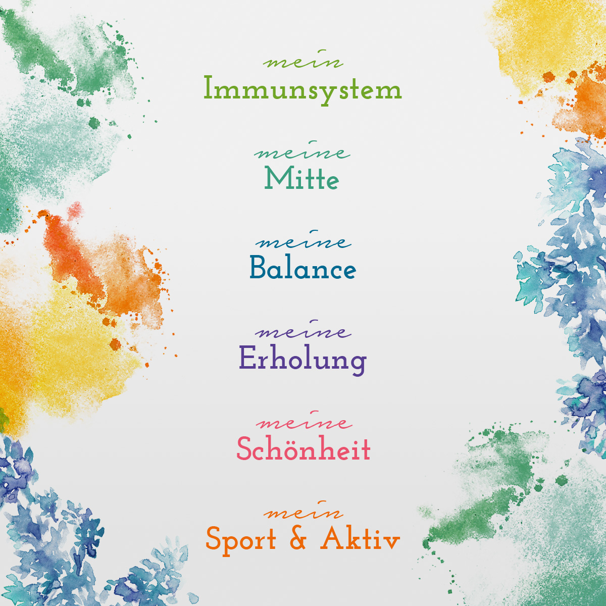
The development of a concept for the various product lines as well as the elaboration of a claim has been made in addition to the logo. ‚Meine Balance‘, ‚Meine Erholung‘ und Co. have been each equipped with a proper color scheme with fitting illustration in watercolor style.
The products of Hasana will help you reaching a state of spiritual and physical wellbeing, unless the mere view of the Hasana corporate identity already does.
It’s best to have a look right away:
www.hasana.at
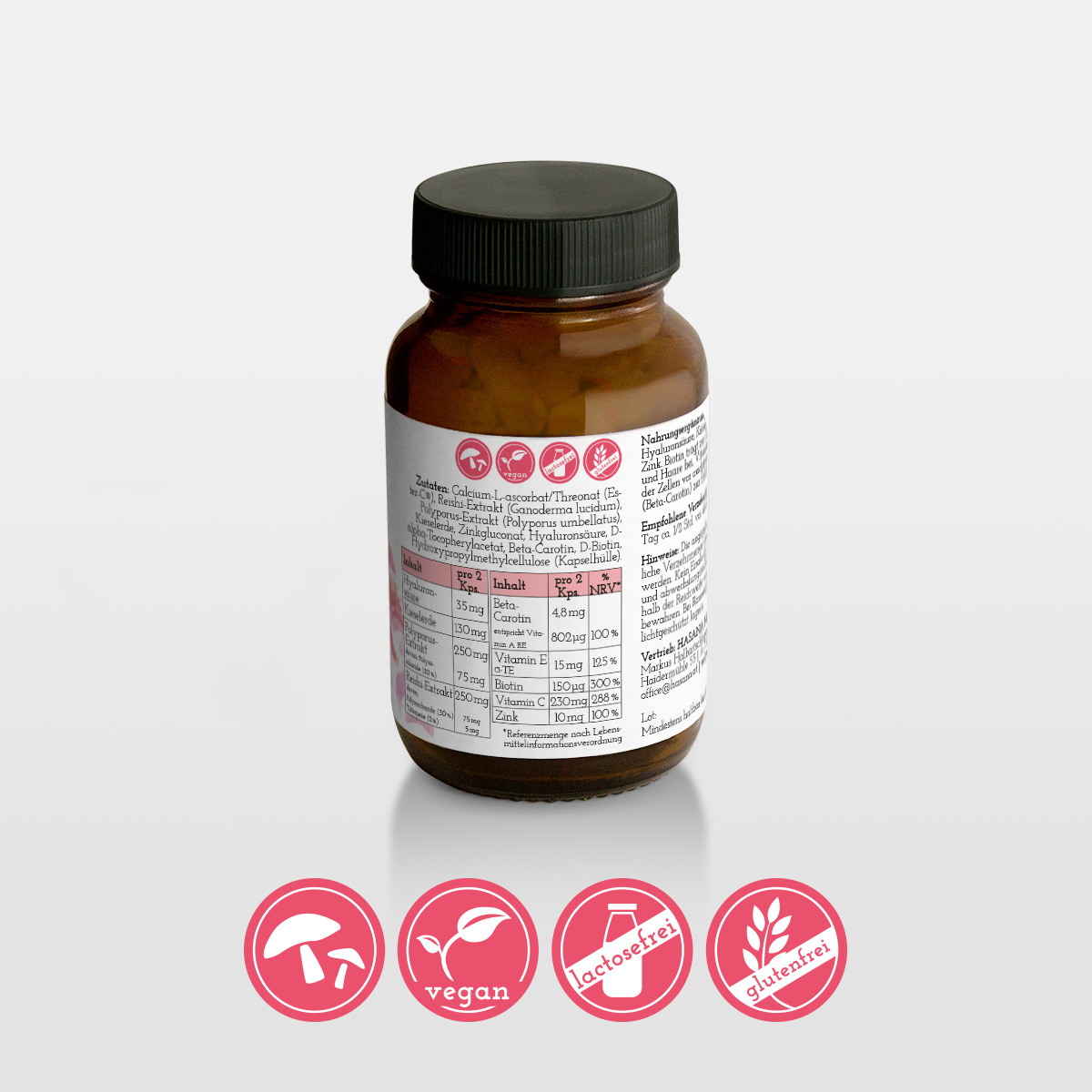
Ingredients:
Logo & Corporate Design
Print forms
Website
Spices:
100 ml Corporate Design
2 Tsp Color Scheme
1 Portion Creativity
2 Tsp fitting Texts