Screen Design for Parkhotel Brunauer
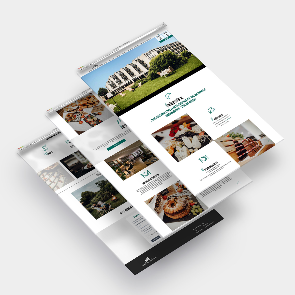
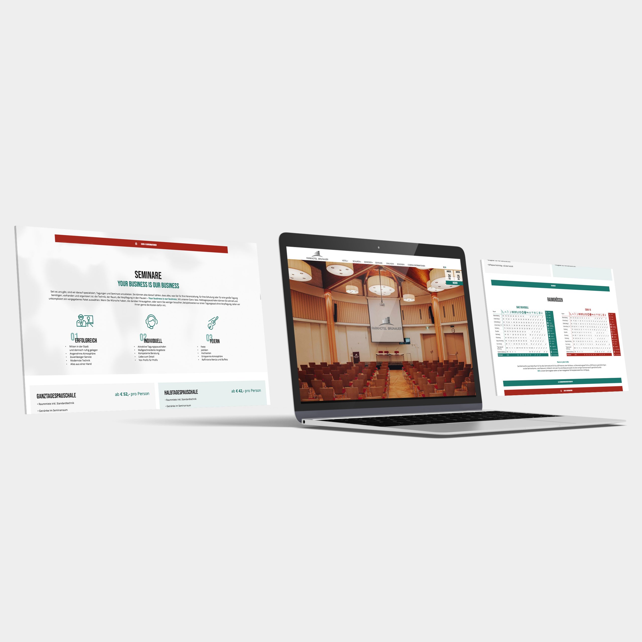
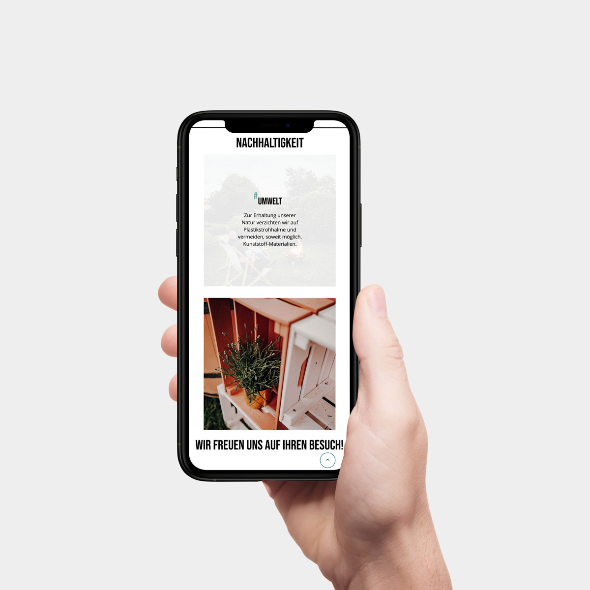
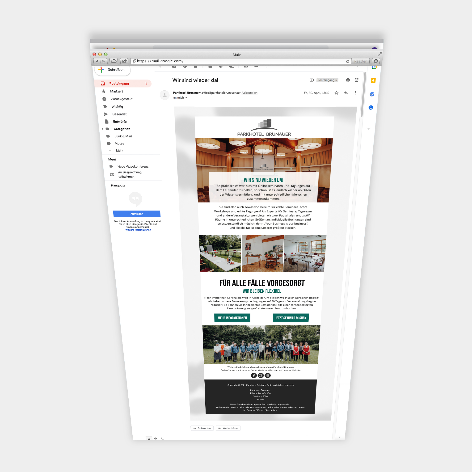
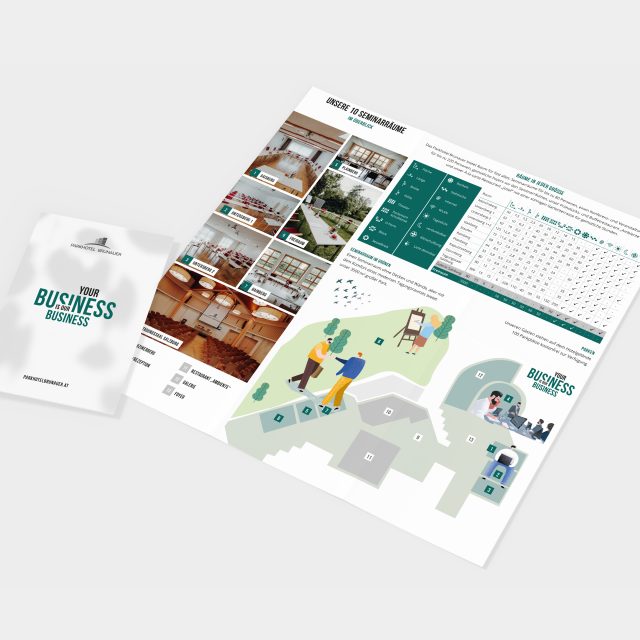
A refreshing dish from the ARTINA creative kitchen: the relaunch of the website for the Parkhotel Brunauer in the heart of Salzburg. In the course of the redesign of the website, the corporate identity of the seminar hotel was also redefined. Due to the clear typography and the combination of black and white with teal, the page looks classy and trustworthy at the same time. Stylized icons matching the CI loosen up the page and make the important bullet points easy to digest. But not enough of this feast for the eyes with the website. Our Artina design chefs were also able to create the screen design for the hotel’s newsletter, based on the design of the website. Regardless of whether you are traveling for business or pleasure – the Parkhotel Brunauer is definitely a good choice!
Desire for a downtime in the city of Mozart? This way: parkhotelbrunauer.at
Ingredients:
Responsive Webdesign
Spices:
100 ml fancy colors
3 TL strong typography
1 portion matching icons
50 ml decent usability