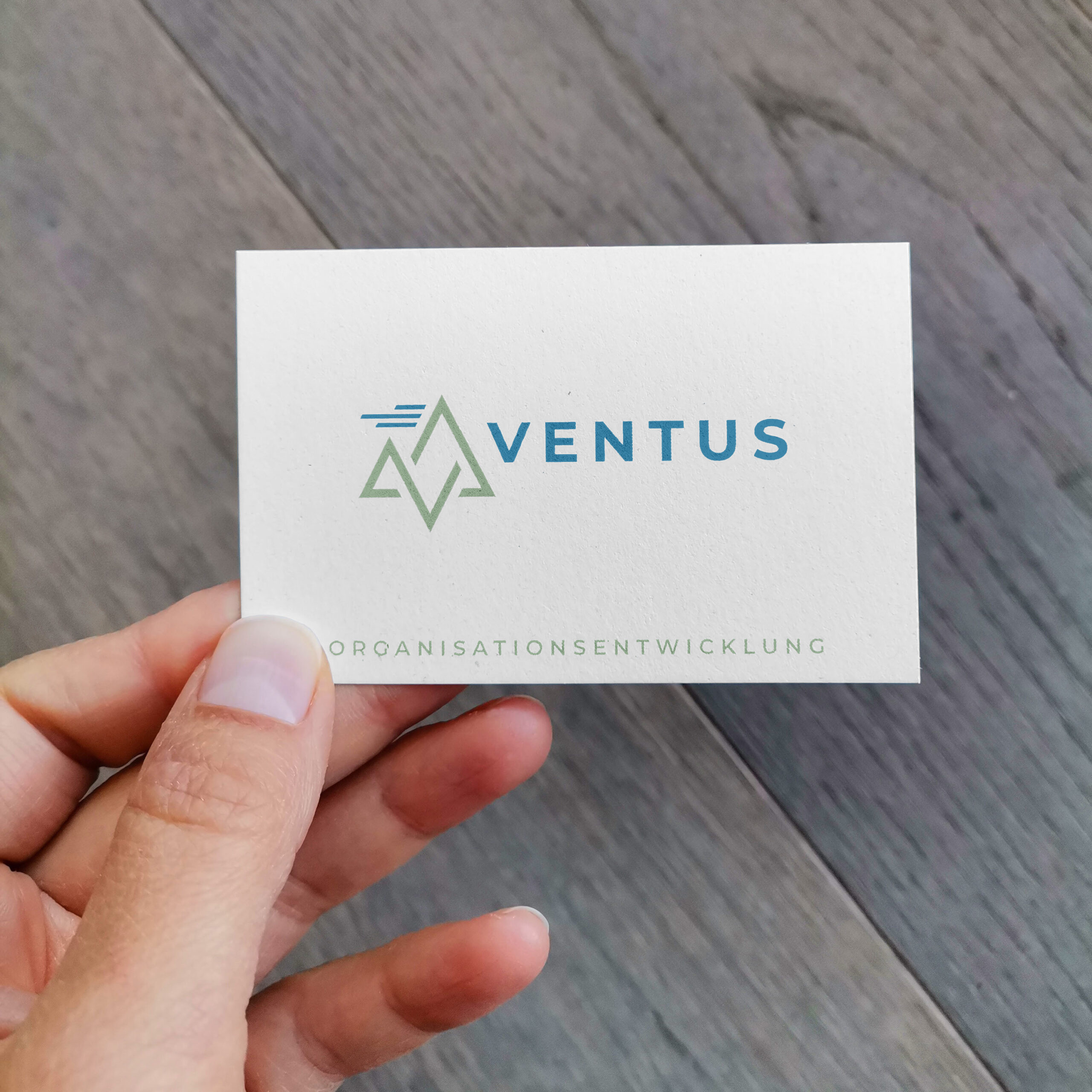
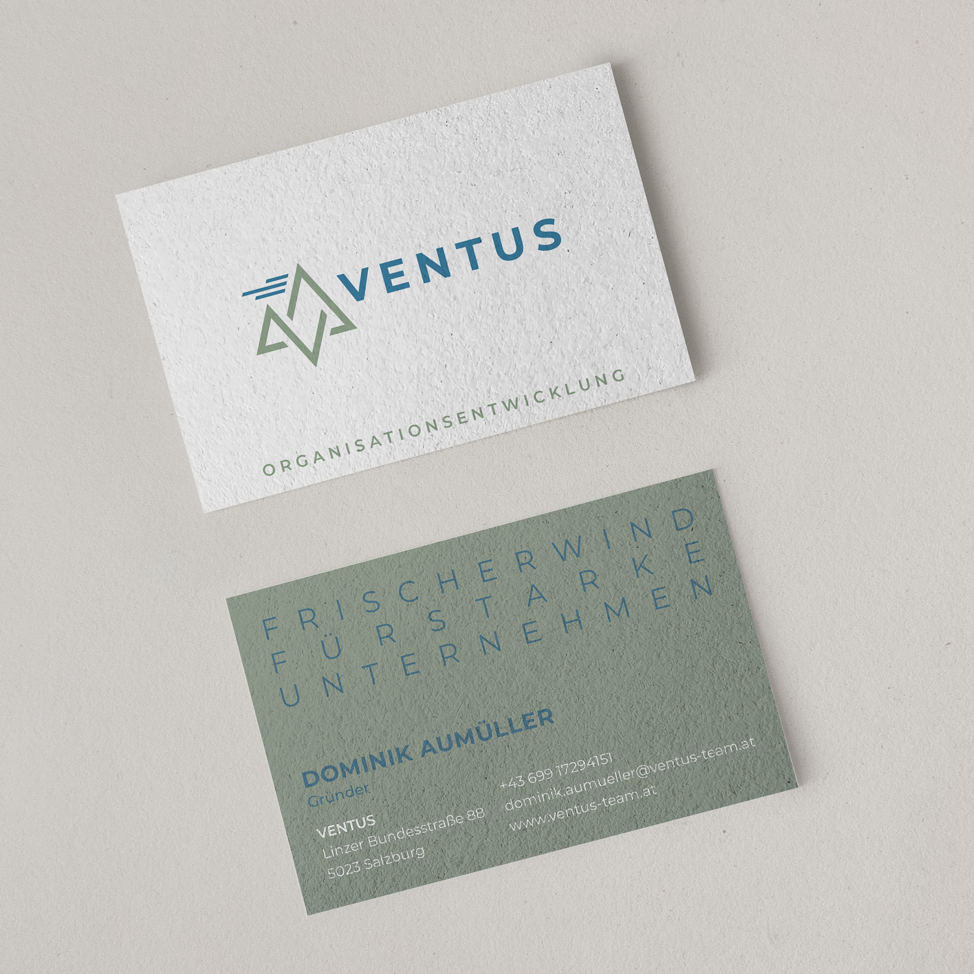
Ventus becomes a brand
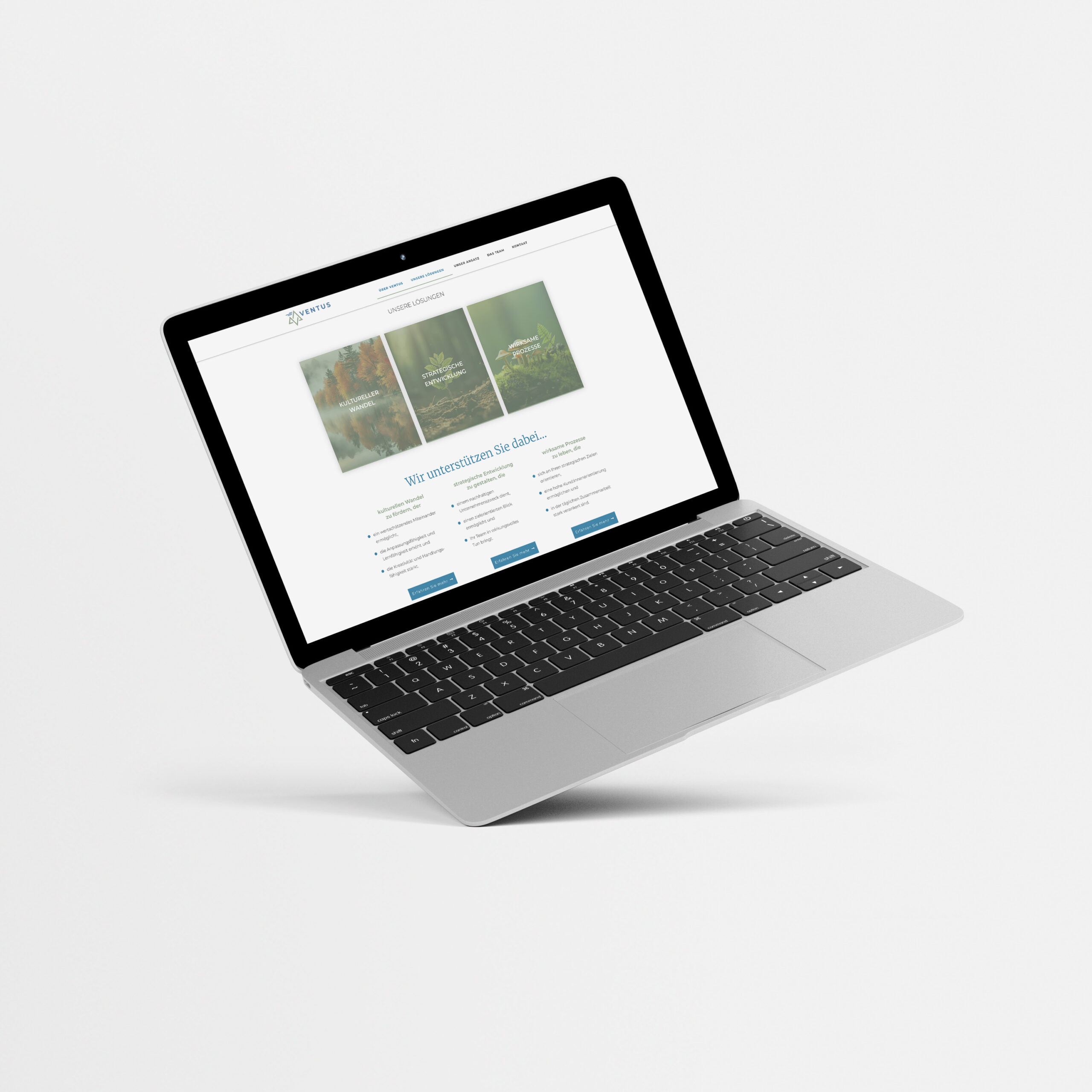
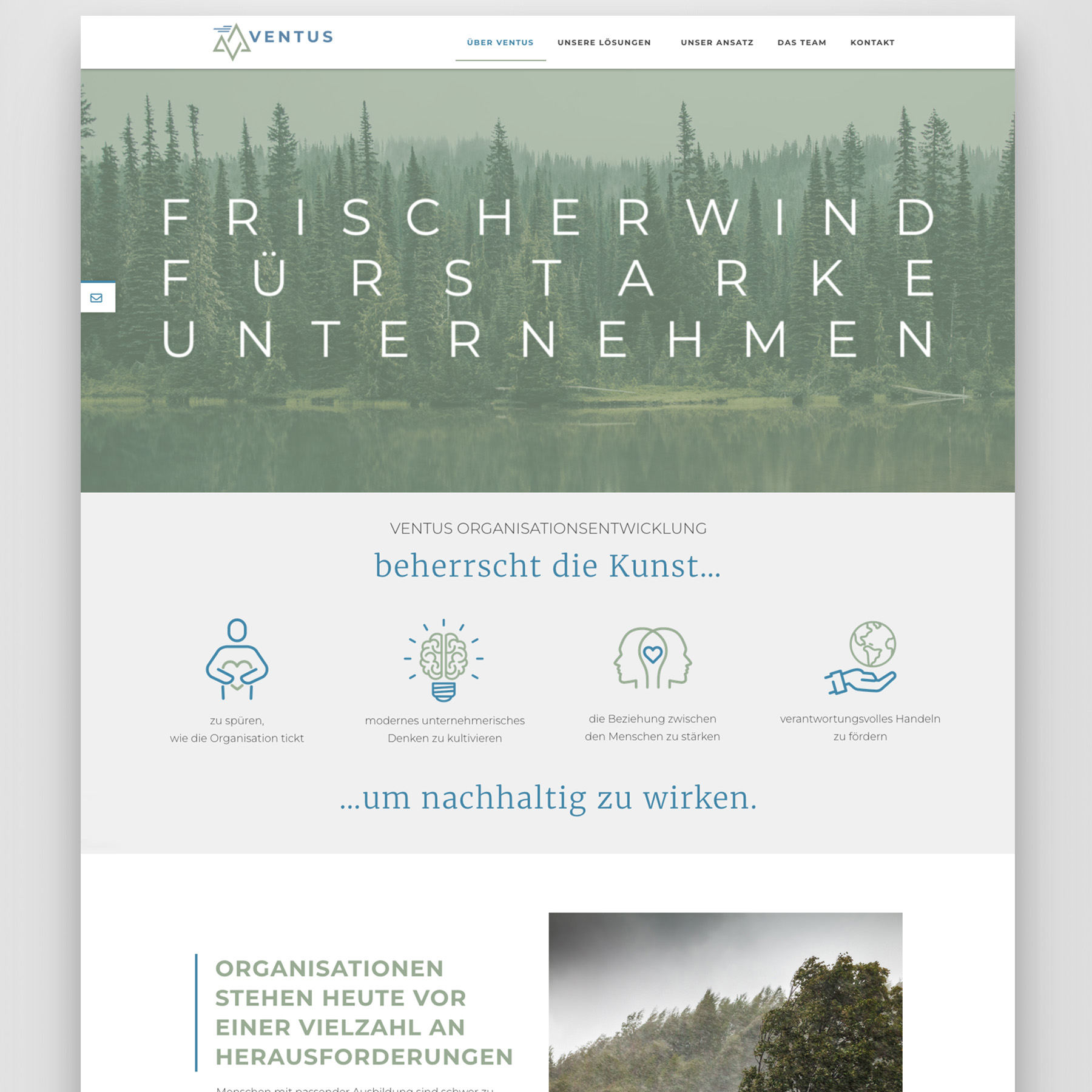
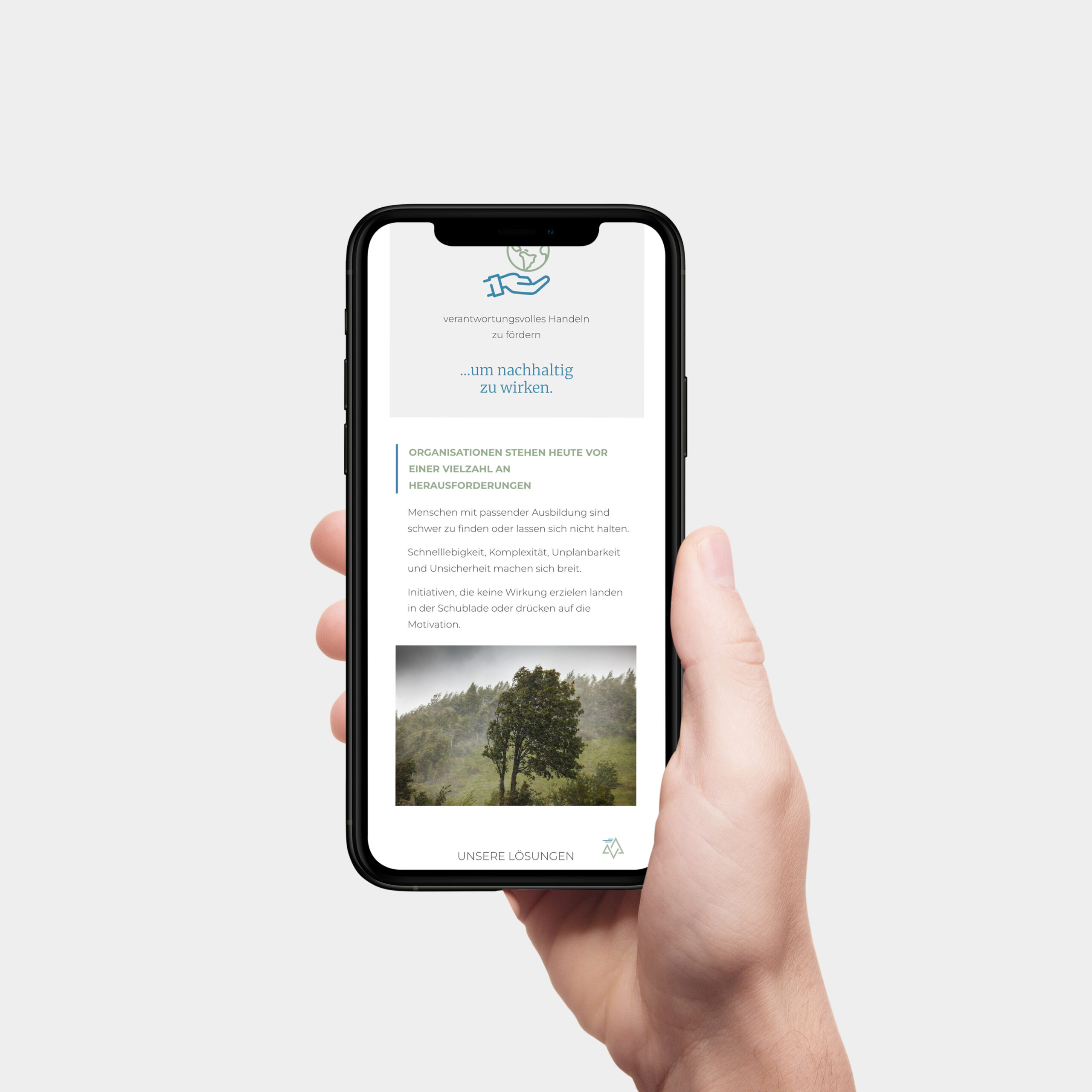
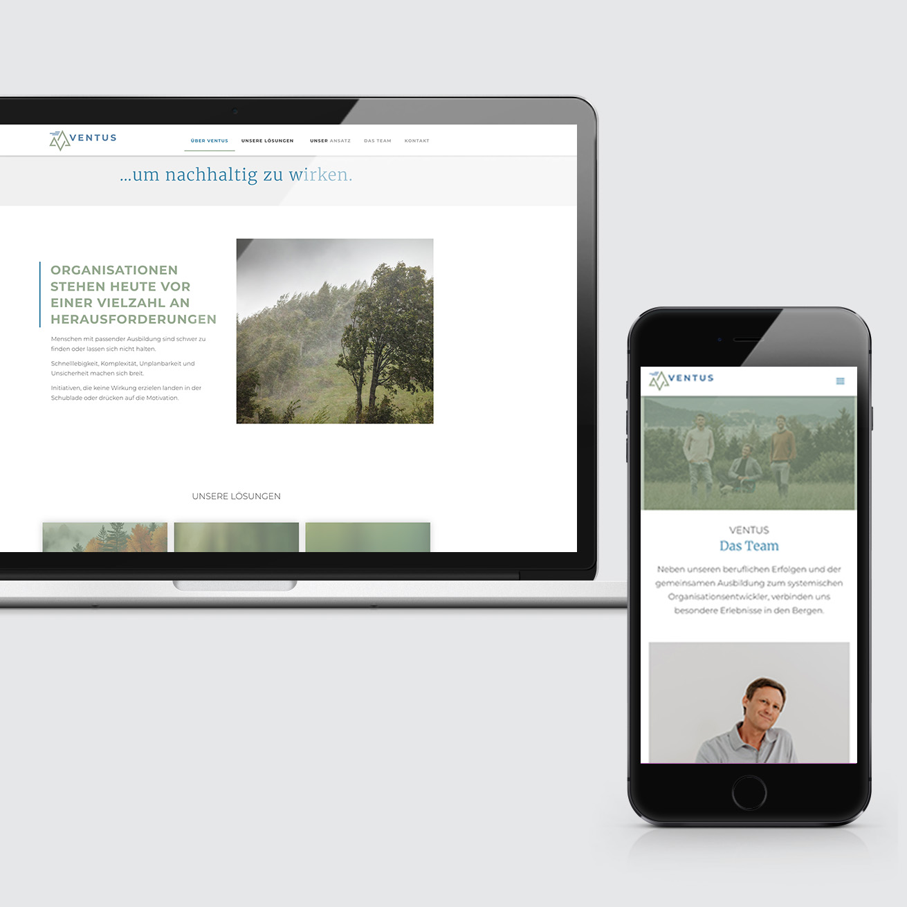
We were able to give Ventus Organizational Development not a pinch, but in this case a ‘breeze’ of graphic tailwind. Having been working as a consulting team for some time, we were commissioned to develop a joint graphic appearance for Ventus. A special feature in their range of activities, the team offsites and the love for nature and mountains inspired us to create the new logo. The clearly structured approach is reflected in the clean, bright layouts. The branding recipe stands out from competitors with its natural color scheme and immediately shows what you can expect from Ventus: namely clear, tailor-made solutions for sustainable corporate success.
Ingredients:
Corporate Design
Print Design
Web Design
Spices:
1 L soft color scheme
500 g clear overall image
1 pinch/breeze of graphic tailwind