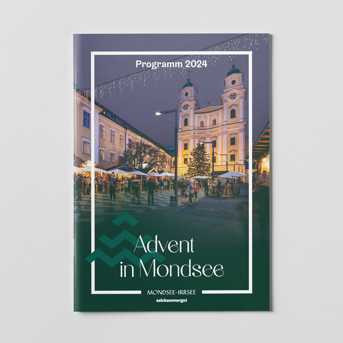
Advent in Mondsee Branding
For the redesign of the ‘Advent in Mondsee’ branding, we set ourselves the goal of capturing the unique character and the special location of Advent in Mondsee. Not a ready-made Advent design, but something very personal!
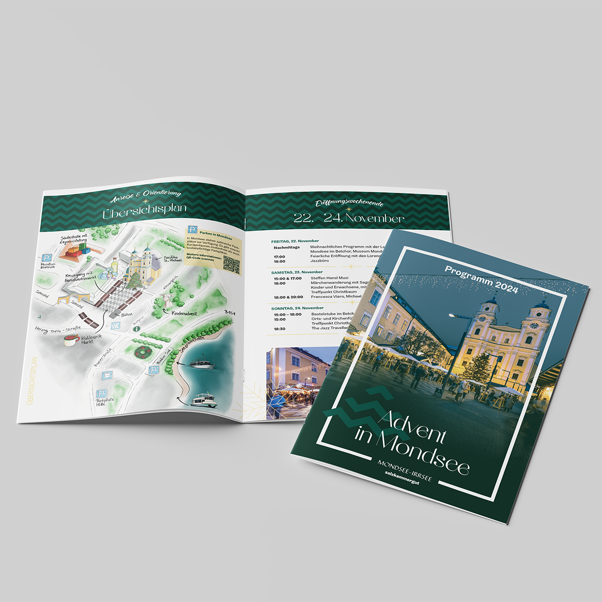
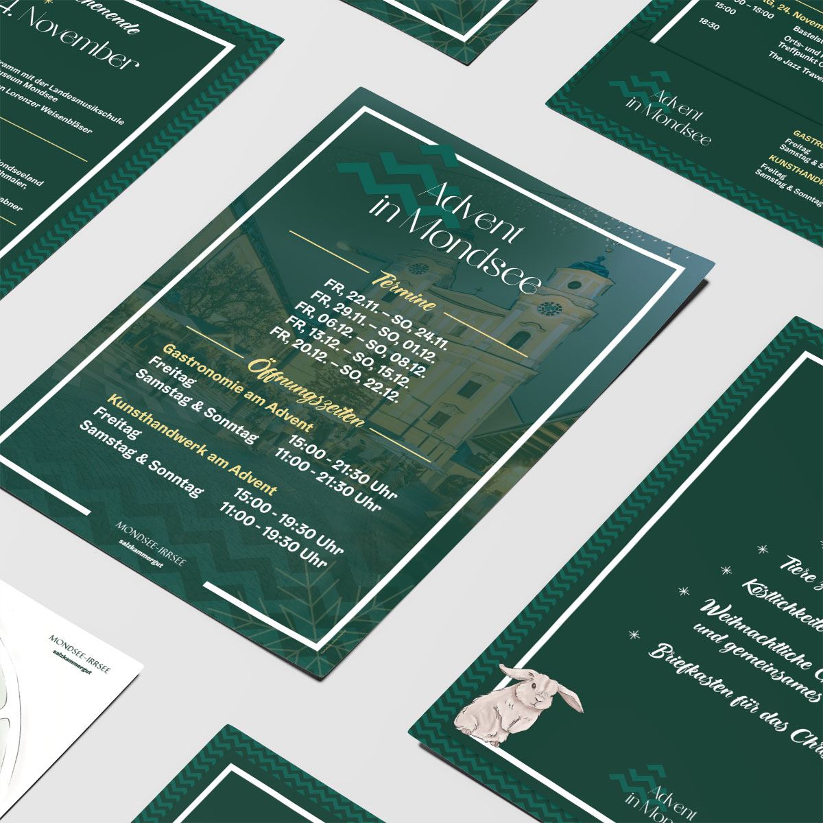
To do this, it was worth paying attention to a detail that we noticed again and again in photos – the jagged striped floor in front of the basilica! This inspiration formed the basis for the new logo, various sub-logos and a matching, festive pattern.
In the logo, the stripes are arranged as a Christmas tree, while in the sub-logo for the Advent boat trips they are arranged as waves.
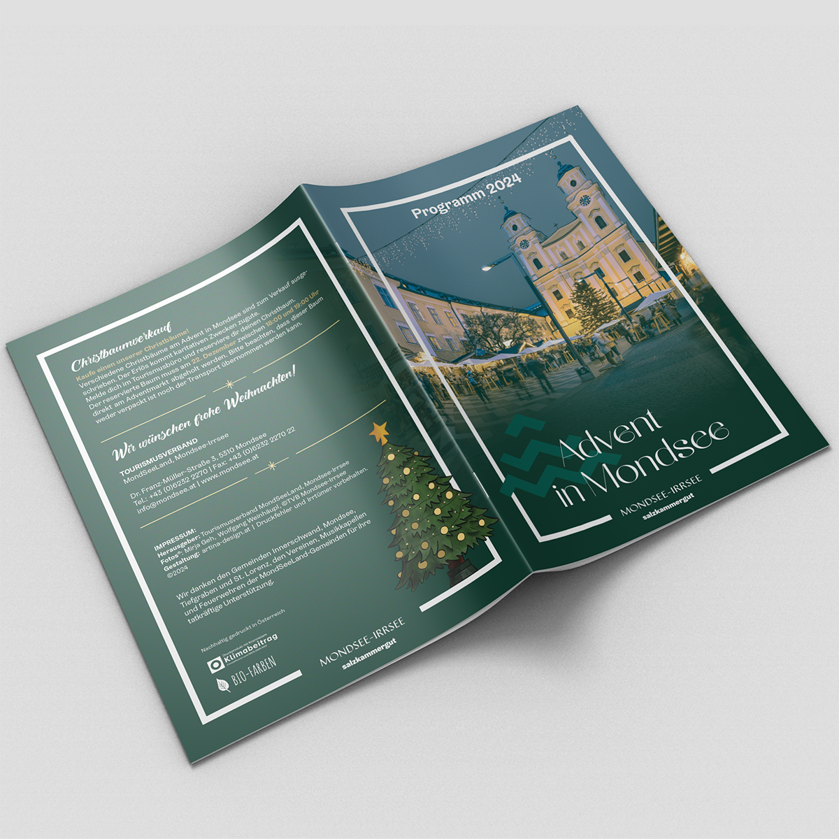
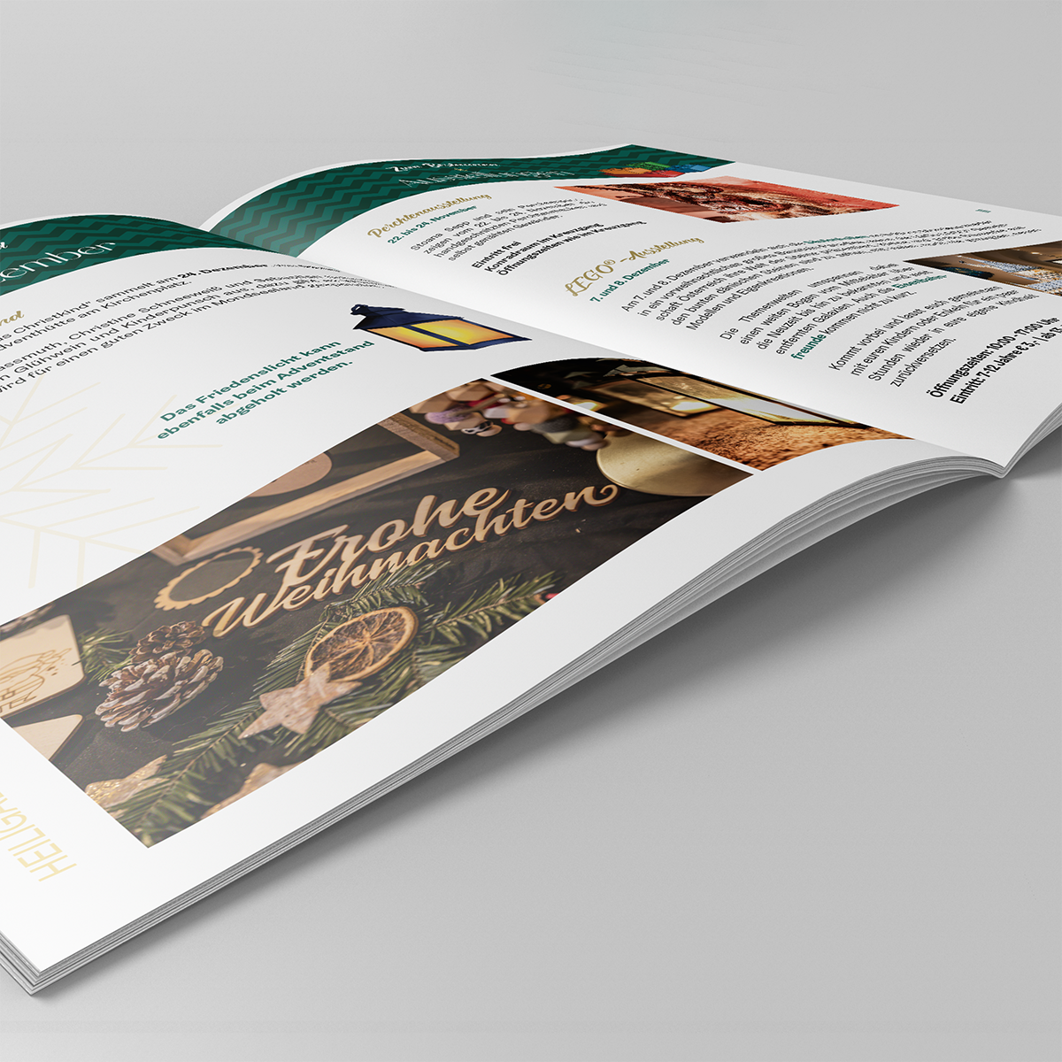
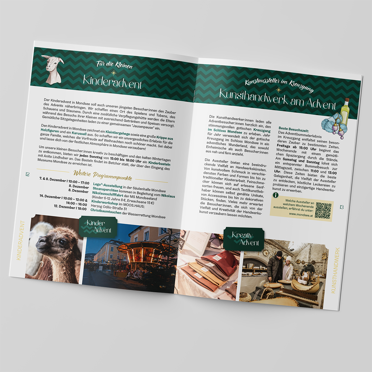
For the design of the program booklet and the various printed materials, the CI pattern is a particularly important element alongside hand-drawn, atmospheric illustrations.
Which colors represent the Advent season better than fir green and gold? For the specific “this is Mondsee” accent, the Mondsee with its wintery lake green was of course a must.
Ingredients:
Logo & Corporate Design
Program booklet
Orientation map
Various posters
Instagram templates
Spices:
2 L modular zigzag
50 ml Advent spirit
200 g hand-drawn illustrations
1 pinch of festive colors