Corporate Identity for Open Air Restaurant Josef
We were allowed to design a graphic gourmet menu for Salzburg’s only open air restaurant. We started with the logo and the color scheme as the first course. As the second course we served the corresponding CI and ended the culinary gourmet tour with the conception of various print products.
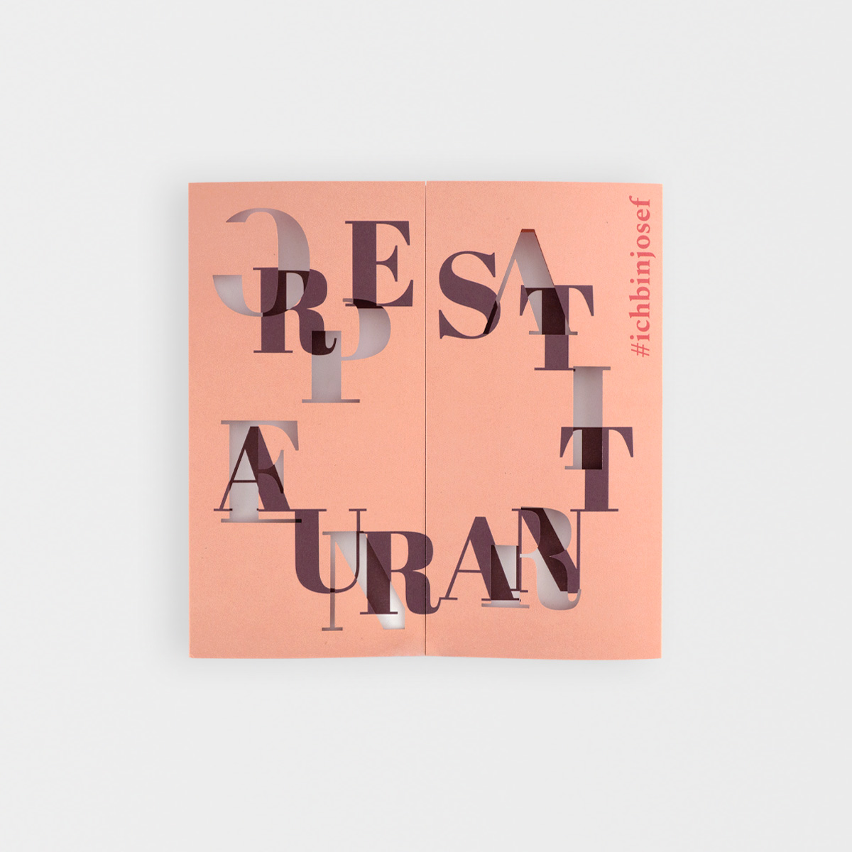
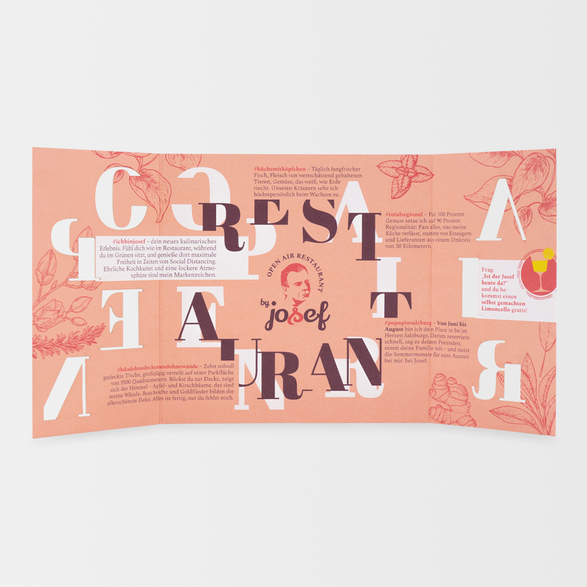
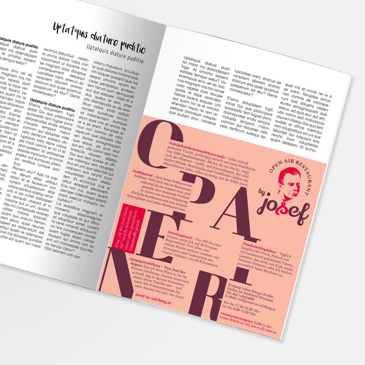
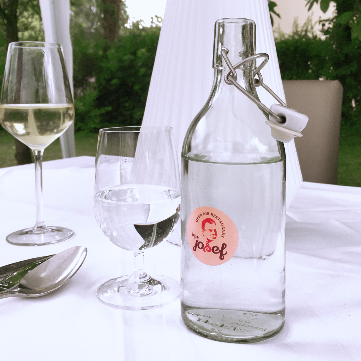
The logo is inspired by the New York industrial style and should appear bold and striking. The original color scheme and the flat effect create a strong appearance of the restaurant. The founder Josef Brunauer, who was immortalized in the logo with a paper cut effect, forms a creative delicacy. Modern fonts with retro charm were used for the text, which harmonize with the figurative mark.
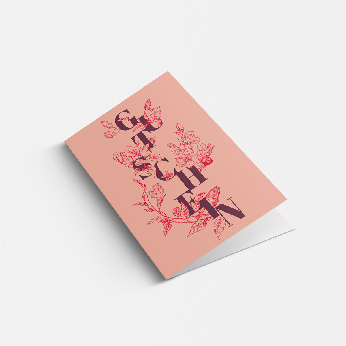
When creating new projects in the corporate design, we rely on unusual compositions of letters. Often in combination with background illustrations on the respective topic. These eye-catchers can be found in various print products.
Do you want a second serving? Get it on josef-in-salzburg.at
Ingredients:
Logo
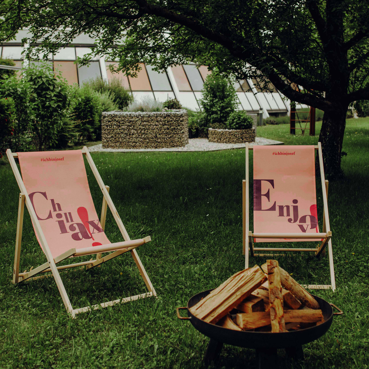
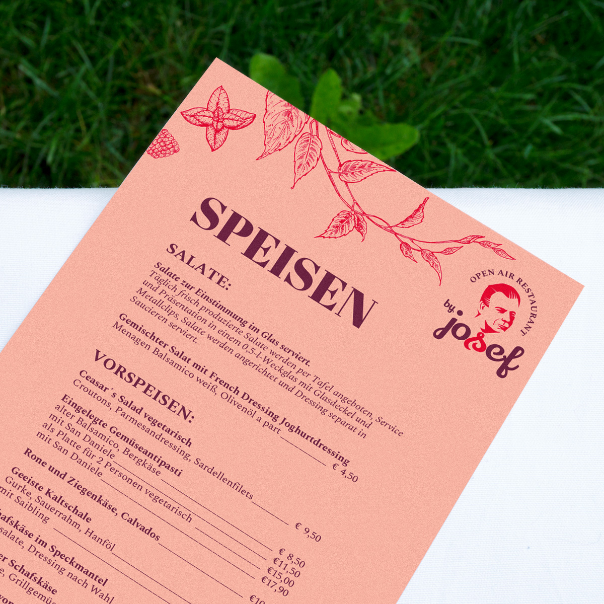
Corporate Design
Print Design
Spices:
50 ml warm color scheme
2 tsp Typography
3 Packages retro charm
1 breeze Illustration